New themes from The Color Association of the United States
First, Pantone’s Color of the Year (Emerald for 2013) morphed from a design industry standard to something the entire public anticipates and follows. Now, The Color Association of the United States has developed a Spring/Summer 2013 Beauty Forecast. Different from color of the year, the beauty forecast “takes a more tactile approach to color inspiration”, including an inspirational mix of 3D objects and products.
The idea is to help designers of all ilk be more creative with color and, with this storyboard, how it mixes with texture. We could all benefit from a little creativity, no?
According to renowned color expert Leslie Harrington, “What designers, developers, and marketers really need is to engage the senses – to experience the foreseen new palettes through their senses … It’s the only way to really design for the future.”
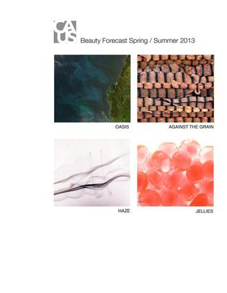
The Spring/Summer2013 Beauty Forecast is “driven by a range of colors available in naturally derived pigments”, and focuses on four different themes:
OASIS
Key inspirations: the ocean, the sky, greenery, plants, flowers, and birds.
Think: freshwater, sea air, and crisp greenery.
AGAINST THE GRAIN
Key inspirations: reminds us of what Spring is really about—rebirth and renewal.
Think: a range of autumnal colors, warmth, and luxury.
HAZE
Key inspirations: softer vamp—a lighter palette but retaining an edgy quality.
Think: colors with a murky undertone, tints and tones of purple.
JELLIES
Key inspiration: interactive and fun; all about customization
Think: colors are sheer and meant to be layered individually, or by mixing multiples.

